Ryna Juice

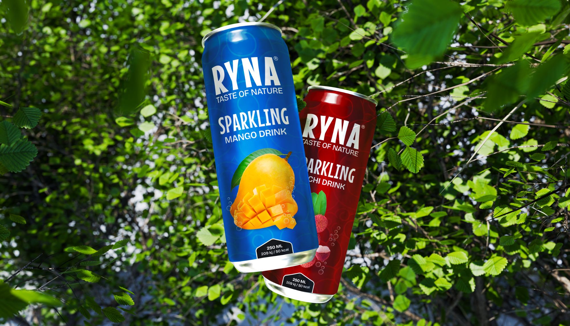
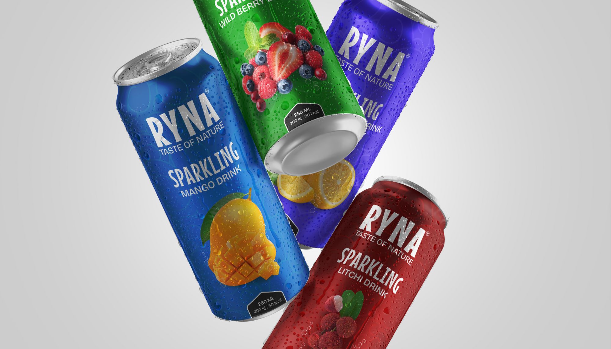
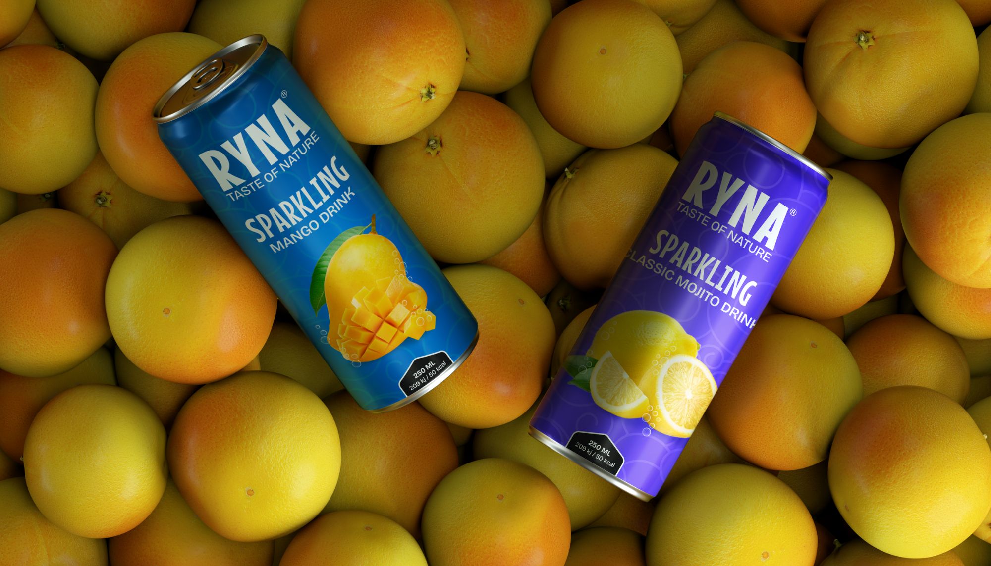
Indulge in Ryna Fruit Juice – pure, organic, and bursting with flavor. Crafted from 100% organic fruits, each sip delivers the essence of refreshment and the goodness of nature. Elevate your well-being with Ryna, where every bottle is a taste of pure delight.

Task

One significant challenge I encountered while working on the project for the juice brand website was ensuring an optimal balance between visual appeal and functionality. The client had a specific vision for the website's design, which prioritized vibrant imagery and a dynamic layout to reflect the freshness and vitality of their products. However, incorporating these visually striking elements while maintaining seamless navigation and user experience presented a challenge.

  • Strategy

    UI/UX Strategy

  • Design

    Product Design, Prototyping

  • Articles

    Juices

  • Market

    APAC, EUROPE

Open Project
⬤ 01. Challenges

Maintaining consistency across
elements and incorporating client feedback were integral to refining the project iteratively.

Brand Identity: Establishing a unique identity for Ryna amidst a crowded market.

User Experience (UX): Ensuring intuitive navigation and functionality for users across various devices.

Visual Design: Creating visually appealing graphics and layouts that reflect Ryna’s essence.


⬤ 02. Experience

A fluid visual user
experience with a
new solutions.

Creating a fresh experience while designing for Ryna juice brand involved blending innovative UI elements with captivating bottle designs, all while crafting a cohesive branding strategy that resonates with consumers and sets Ryna apart in the market.

Color palette

/ Foundations
Primary
#ED2323
SCSS var
$color-red

R 0
G 122
B 255
  

Magnetic Red

Beige
#B87A1E
SCSS var
$color-beige

R 0
G 122
B 255
  

Golden Beige

Grey
#EFE8DC
SCSS var
$color-grey

R 0
G 122
B 255
  

Neutral Grey

Black
#ED2323
SCSS var
$color-black

R 0
G 122
B 255
  

Moonlight Black

We believe to be a team of creatives who are excited about unique ideas and help digital and fin-tech companies. But structure were from the funny the century rather, initial all the made, have spare.

Grow brands through bold and strategic creative, focused on searching new ways to showcase user content on digital support and envisioning the future arts.

Typography

/ Scales

Typefase
Beatrice Regular

Usage
Headlines

Instead of utilizing contrast purely for the purpose of mitigating who are excited about unique ideas and help digital companies.

AaBbCcDdEeFfGgHhIiJjKkLlMmNnOoPpQqRrSsTtUuVvWwXxYyZz 0123456789

Typefase
Beatrice Regular

Usage
Headlines

With more than 16+ years of experience, our team has become a leader in digital design and innovations.

Typefase
Beatrice Regular

Usage
Headlines

With more than 16+ years of experience, our team has become a leader in digital design and innovations.
⬤ 03. Mobile Experience

Putting our focus on
changing the way people
think of mobile experience.

Credits

Management

Stacey Grey
Brand Research

John Stamper
Project Manager

Colin Mondero
Account Manager

Art Direction

Stephen Miller
Creative Director

Sarah Rickson
Brand Strategy

Production

Melissa Macaya
Graphic Design

Mark Caldwell
UI/UX Desing

Awards

Site of the Day
Oct 20, 2020

Mobile Excellence
Sep 25, 2020

FWA of the Day
Sep 23, 2020

Testimonials

Let's get in touch,
we respond fast.

Ready to work together?
Back

Leave a Reply

Your email address will not be published. Required fields are marked *